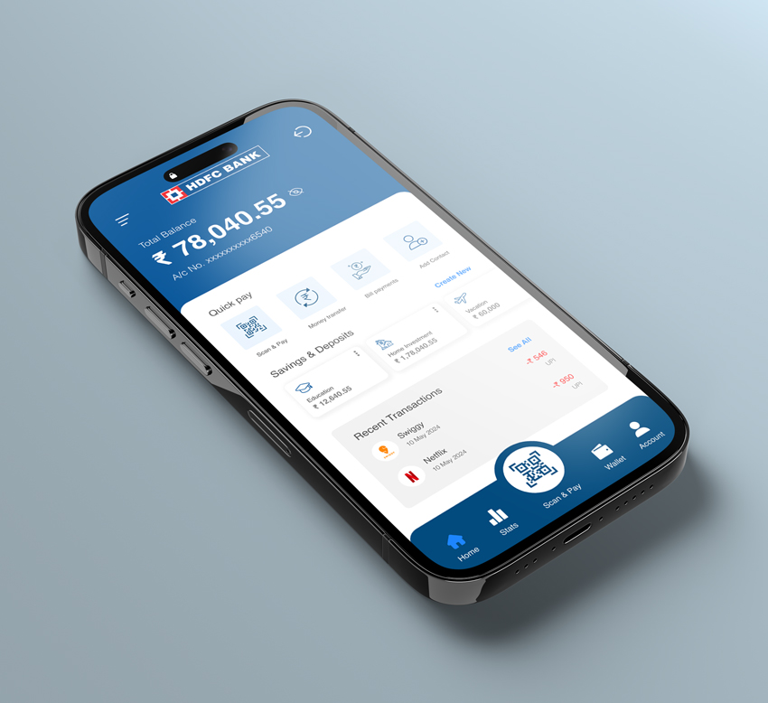
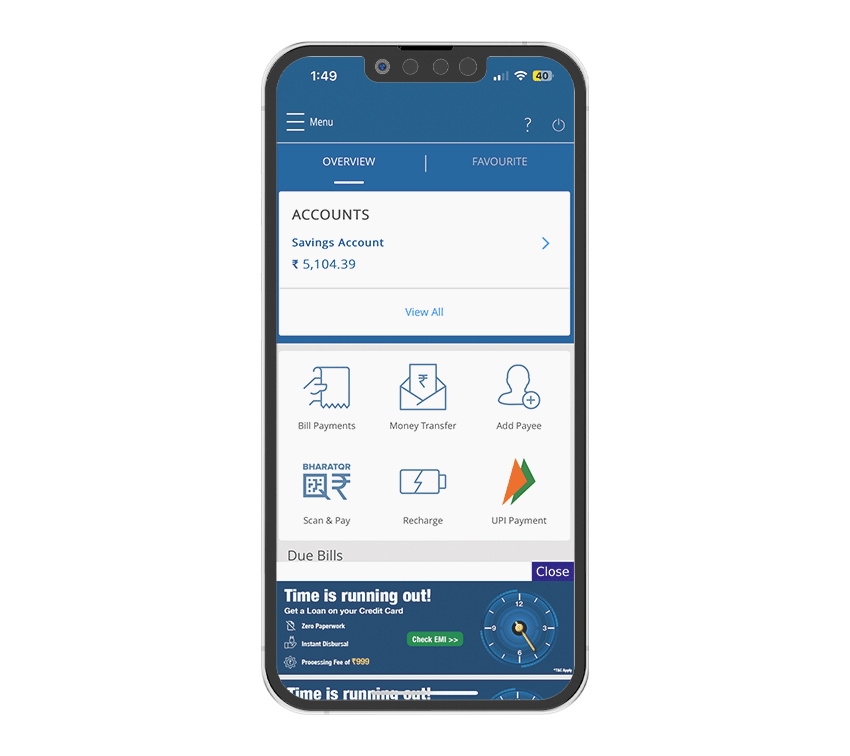
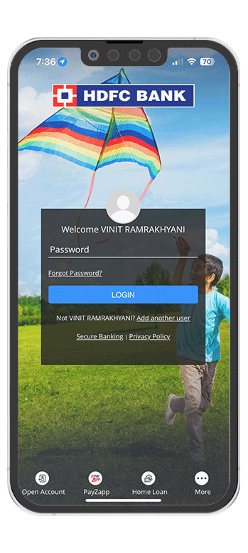
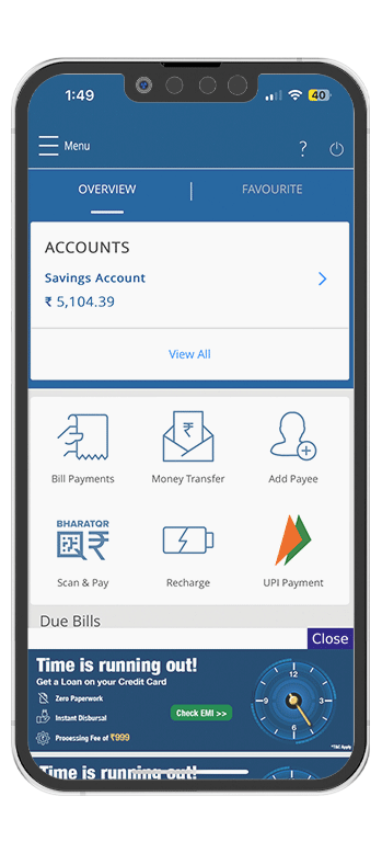
HDFC Bank is a top bank in India, known for its innovation and customer service. It has a large branch network and offers digital banking solutions to meet the evolving needs of its customers.
2024
HDFC Ltd was founded in 1977, when the Late Shri. HT Parekh, Founder and Chairman of HDFC Ltd, dreamt of millions of middle-class citizens of India owning a home and not having to wait till their retirement. Pioneering India’s housing finance industry, the late Shri. Parekh, a Padma Bhushan recipient, built HDFC Ltd on a strong foundation of integrity, transparency, and professionalism.
Taking the legacy further Mr. Deepak Parekh, Chairman HDFC Ltd. and a Padma Bhushan awardee, not only made HDFC the leader in Mortgages, but also transformed it into India's leading Financial Services conglomerate with a presence in Banking, Asset Management, Life Insurance, General Insurance, Real Estate Venture Fund, Education Loans and Education.
Since it was a quick design sprint, I was unable to conduct personal interviews with actual users. However, I utilised alternative research methods such as analysing existing data and studying user reviews on the app store to identify potential issues and gather insights.
After carefully reviewing user feedback and analysing the app layout, I have identified several key insights. To keep track of areas for improvement during the redesign process, I have documented these in the form of a list. So that this list serves as a quick checklist when I later redesign the app.
Due to cluttered home screen, the direct shortcuts are not easily visible and accessible.
The home screen contains irrelevant elements such as an infographic at the bottom.
Navigation bar lacks essential features and should prioritise more important ones.
Lack of visual hierarchy, everything looks equally important.
Multiple ways to perform a task, yet none are efficient.
Design decisions should prioritise readability to ensure that users can easily consume the content.
The app fails to make the user feel secure and free to explore. Hence, users restrict themselves from exploring the app.
The home screen feels cluttered and overwhelms users due to the poor placement of elements.
The interface appears overcrowded, especially with multiple sections like accounts, bill payments, and advertisements,making it overwhelming for users to navigate.
The large, prominent advertisement banner at the bottom distracts from the primary banking functions and reduces the overall usability of the app.
Significant portions of the screen, such as the large icons and empty spaces around them, are not utilised efficiently, leading to a less streamlined user experience.
Important elements, such as the account balance, are not sufficiently differentiated from secondary options like bill payments and recharges, making it hard for users to quickly identify key information.
I have selected the following screens for redesign because they have received the maximum bad reviews, and a user of this app myself, I struggle to perform simple tasks.
These are the top three sprint goals that I poured the most effort into during the redesign journey. While there were plenty of other things I worked on, these three the key areas I paid the most attention to.
To reduce the number of taps to make the flow more easy to understand.
Simplify the account management process to make it easier for users to track their finances.
Implement intuitive and user-friendly transactional flows for seamless money transfers.
In the redesign banking app, I made several improvements to enhance the user experience. Here are the features I improved and the reasoning behind each:
The new design uses a clean and minimal layout, reducing clutter and making the interface more visually appealing and easier to navigate.
The total balance and account number are prominently displayed at the top, providing users with immediate access to essential information.
The "Quick Pay" section consolidates key actions (Scan & Pay, Money Transfer, Bill Payments, Add Contact) into a single, easy-to-access area, streamlining user actions.
Improved visual hierarchy makes it easier for users to find and understand important sections like Savings & Deposits and Recent Transactions.
The bottom navigation bar includes clear icons and labels (Home, Stats, Scan & Pay, Wallet, Account), making it easy for users to switch between different functionalities.
The redesign removes intrusive advertisement banners, enhancing the user experience by focusing on core banking functions without distractions.