The Indian Railway Catering and Tourism Corporation (IRCTC) is a subsidiary of the Indian Railways that handles the catering, tourism, and online ticketing operations across India. Established in 1999, IRCTC has revolutionized the way millions of Indians book train tickets by providing a convenient and efficient online platform, eliminating the need for lengthy queues and simplifying the reservation process. In addition to ticketing, IRCTC also offers various services including catering on trains and at stations, packaged drinking water under the brand 'Rail Neer', and diverse tourism packages covering pilgrimages, leisure travel, and adventure tours.
2024
The IRCTC mobile application extends the convenience of its online services to smartphones, making train ticket booking and related services accessible anytime and anywhere. Serving a massive user base, the app plays a crucial role in facilitating daily commutes and travel plans for people across the country.
Despite its widespread usage, the app has faced challenges related to user experience, such as complex navigation and performance issues, highlighting the need for thoughtful redesigns to enhance usability and meet the evolving expectations of modern travelers.
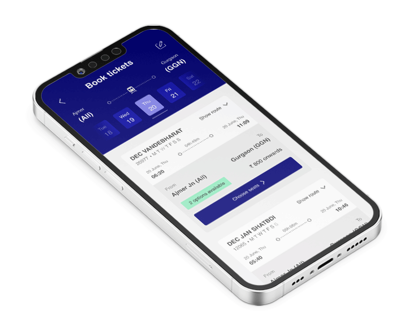
Before diving into the redesign process, I conducted thorough desk research by analyzing user reviews and feedback across various platforms, including app stores, social media, and online forums. The IRCTC app, being one of the most widely used railway booking platforms in India, had a substantial amount of user feedback.
From the desk research, several key insights emerged that shaped the direction of the redesign:
Users desired a more straightforward, streamlined interface that allowed them to complete tasks with minimal steps.
Performance optimization was crucial. Users needed the app to be responsive and quick, especially during peak booking hours.
A modern, clean design was necessary to improve the app's usability and aesthetic appeal.
Adding features that catered to individual user preferences could significantly enhance user satisfaction and loyalty.
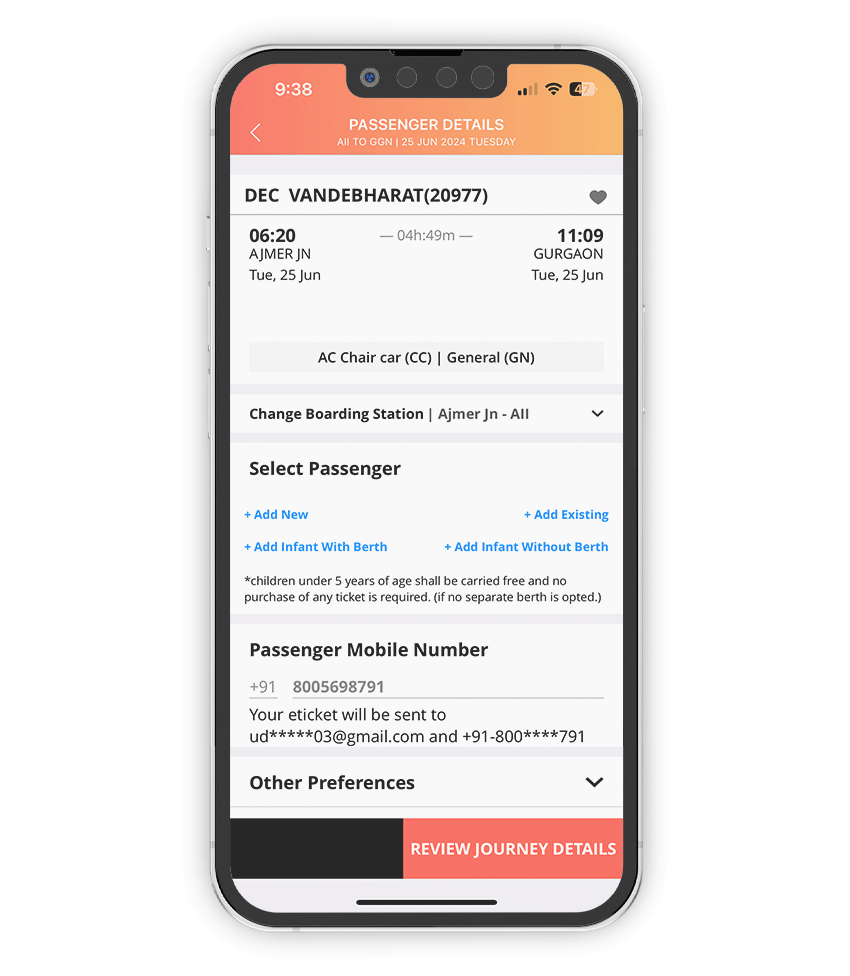
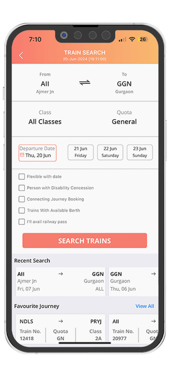
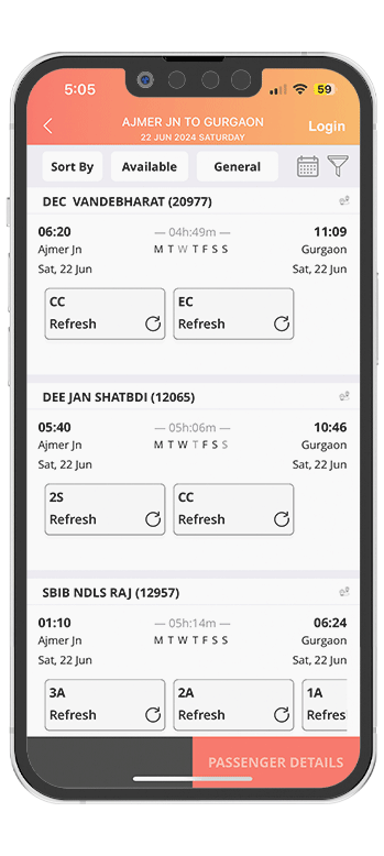
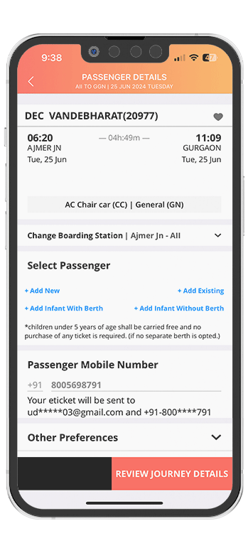
The screens show a lot of information packed into small spaces, which can overwhelm users. The lack of clear separation between different sections, like train details, passenger information, and actions, makes it harder for users to focus on specific tasks.
While some elements like train departure and arrival times are prominent, other important details such as class availability and passenger options are less distinct. This inconsistency can lead to confusion, as users may struggle to identify what’s most important on the screen.
The buttons and interactive elements, such as "Refresh" and "Add New," lack visual or tactile feedback that confirms a user's action. This can create uncertainty about whether an action has been registered, potentially leading to repeated clicks or frustration.
The app's design, particularly the color scheme and iconography, feels dated and may not appeal to modern users accustomed to more contemporary app designs. The gradient background and low-contrast text could also impact readability, especially in different lighting conditions.
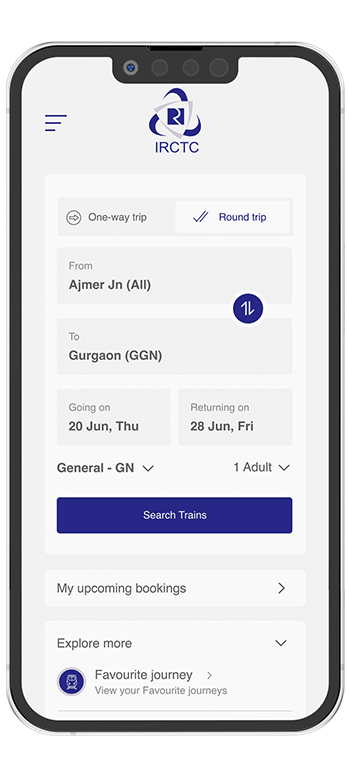
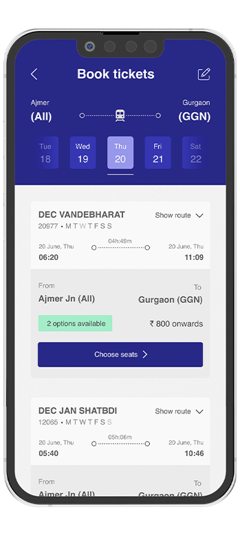
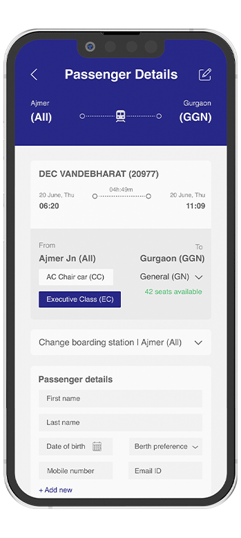
I have selected the following screens for redesign because they have received the maximum bad reviews, and a user of this app myself, I struggle to perform simple tasks.
With the key insights in mind, the sprint goals for the redesign were clearly defined:
To reduce the number of taps to make the flow more easy to understand.
Optimize the app’s backend to ensure faster loading times and smoother transitions between screens.
Update the visual design to create a more engaging and user-friendly experience with better use of space, contrast, and typography.
These insights and design solutions aim to enhance the user experience of the IRCTC app by making it more intuitive, accessible, and user-friendly, ultimately leading to higher user satisfaction and engagement.
Ensure that the most critical information, such as train timings, seat availability, and prices, is prominently displayed at the top of the screen. This helps users make quick decisions without needing to scroll or search.
Minimize the number of steps required to complete a booking by consolidating related actions on a single screen. For example, allow users to select their seats and review journey details without navigating to multiple pages.
Maintain a consistent color scheme and typography throughout the app to create a cohesive visual experience. Consistency not only improves aesthetics but also enhances usability by making the app more predictable.
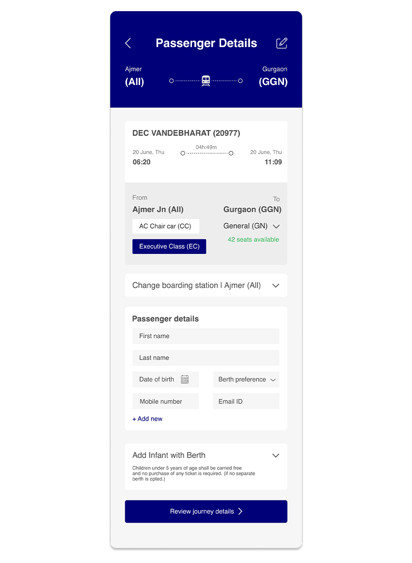
The redesign includes options to change the boarding station and berth preferences, providing users with greater flexibility. Additionally, the ability to add infants with berths caters to a wider audience, ensuring that the app meets the diverse needs of its users.
Incorporate accessibility options, such as text resizing, voice guidance, and high-contrast modes, to make the app usable for people with disabilities. This inclusivity can widen the app's user base and improve user satisfaction.